How our Campaign Data Visualization App Can Help YOU This Election

On November 4th, San Franciscans head to the polls to vote for, amongst other things, a tax on carbonated beverages (aka “Soda”). Did you know that pro-soda tax individuals and committees have raised $224,971 to pass the ordinance, while the soda industry has raised $7,700,000 to defeat it?
To visualize that:

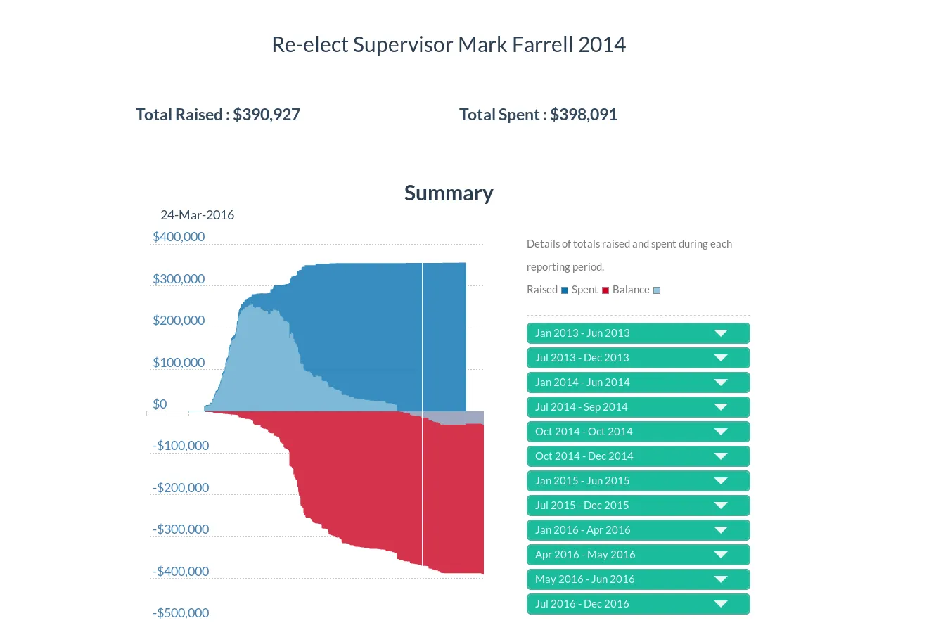
We got that data in a matter of seconds from the San Francisco Brigade’s Campaign Data Visualization App. You can, too.
Let’s face it - whether you’re a journalist covering the election, or just a voter trying to make an informed choice, the best thing to do is “follow the money.” However, San Francisco’s campaign finance data is, to put it simply, a hot mess. If you want to decipher the data, you need to either have:
- a lot of expertise
- a lot of time
Neither of which most voters - and even journalists - have, unless they’re able to devote unfathomable amounts of hours towards poring over datasets. If you’re a journalist on a deadline, or a voter trying to go about your life, this just isn’t feasible.
Which is where the Data Visualization App comes in. See what’s really going on behind the scenes, who’s giving how much money to whom, and help shine a much-needed light on the often murky and labyrinthine world of campaign finance.
At the very least, make an informed decision before you cast your ballot!
Some other interesting findings:
[Coming Soon]
Find out all this, and more, before the election with the San Francisco Brigade’s Campaign Data Visualization App. Access it here: https://election-sf.herokuapp.com/.